
MacVideo provides each user a detailed analytics dashboard overview for all of your content. The My Analytics dashboard accessed from the main menu provides an overview of all your content, whereas you can still see entry level analytics for each video. The dashboard can show your users engagement with specific videos, where they watched it from and with what devices. You can view user engagement in different time periods and compare between them. You can filter your analytics based on a variety of parameters, including location. You can also export your analytics, filter and much more.
To access the main My Analytics dashboard, select My Analytics under the User name drop down menu.
You will then be taken to the analytics dashboard giving you the overview data for all your content.
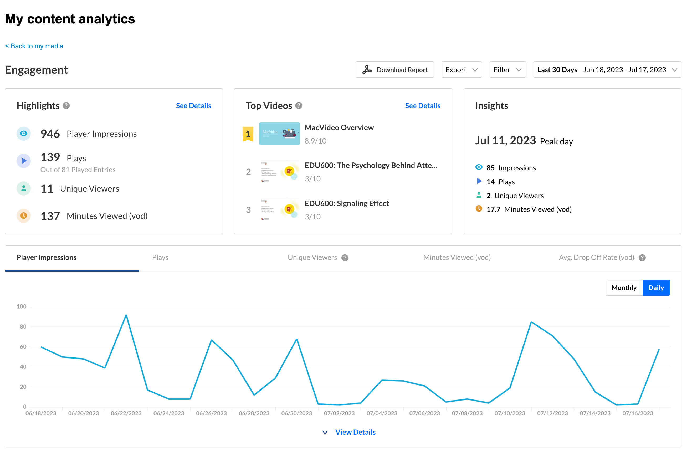
The top panel of the Engagement dashboard provides an overview with Highlights, Top Videos and Insights.
Highlights
Displays a snapshot of the important metrics for the selected timeframe. For each user you will see:
You can also filter by specific metrics, using the Filter field on the top right. You can also download and export the analytics as a report.
Details
Click “View Details” to show engagement activity.
Hover over any point in the graph to see the detailed data. You can click View Details to expand the screen.
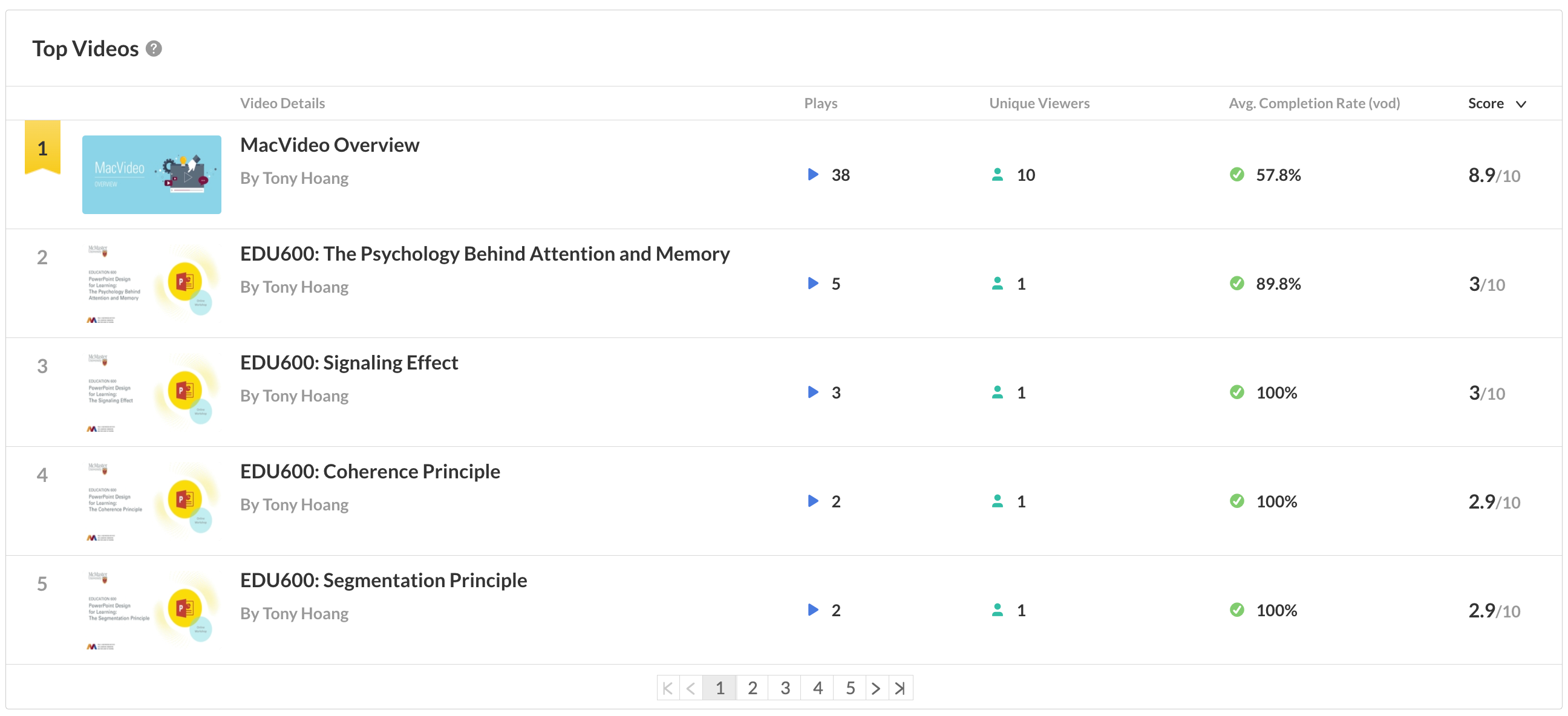
Top Videos
The top videos are selected based on a unique algorithm that takes into consideration parameters such as the amount of plays, unique viewers, and average view period and scores them in comparison to other videos in the account. By clicking on “See Details” in the Top Videos section you can see an in-depth analysis of all the content that was viewed.
Insights
Displays a snapshot of the important metrics for the day
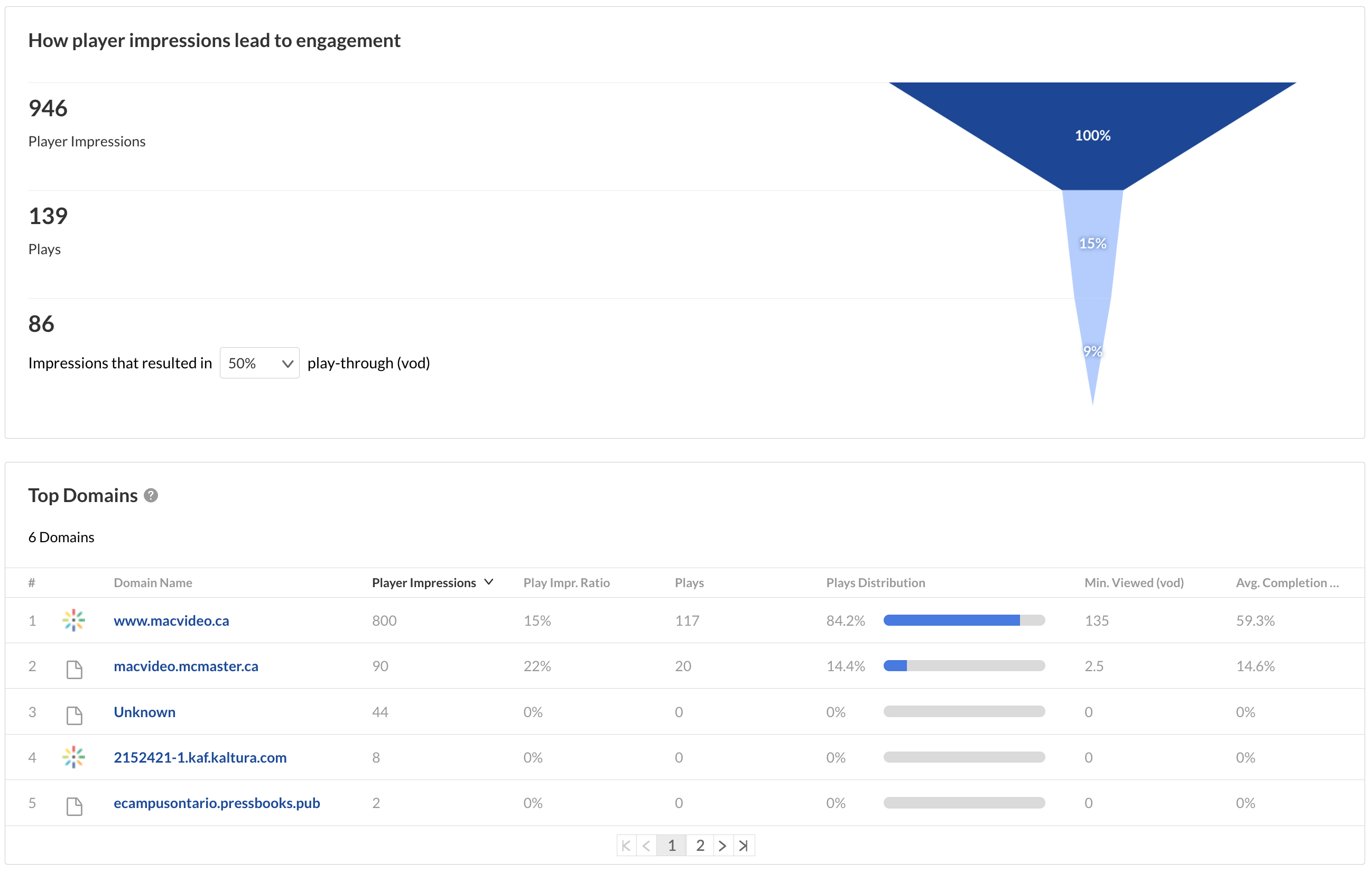
Top Domains
The top domains are arranged according to the highest number of plays in the selected time frame.
If you wish to learn more details about the My Analytics dashboard view the official Kaltura documentation.
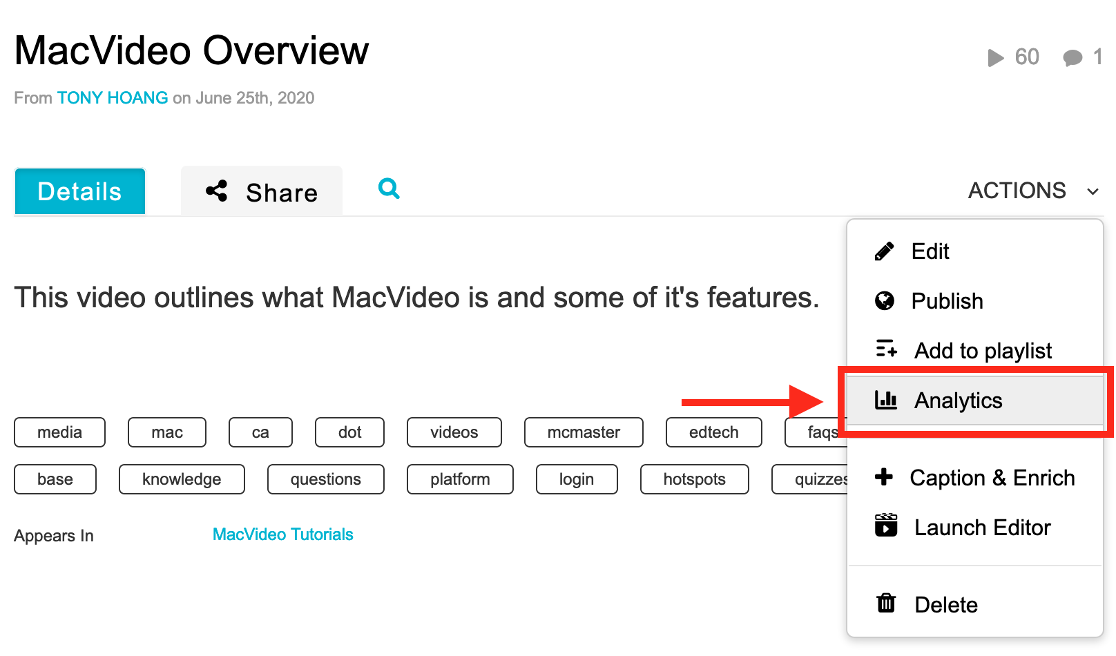
If you want to see entry level analytics for a specific video, there are two ways to access Entry Level analytics in MacVideo.
Option 1:
- Choose My Media from the User drop down menu.
- Click the View Analytics button next to the desired entry.
Option 2:
- Choose My Media from the User drop down menu.
- Click on desired media entry.
- Choose Analytics from the ACTIONS drop down menu.
Below are screenshots showing what the analytics dashboard looks like.
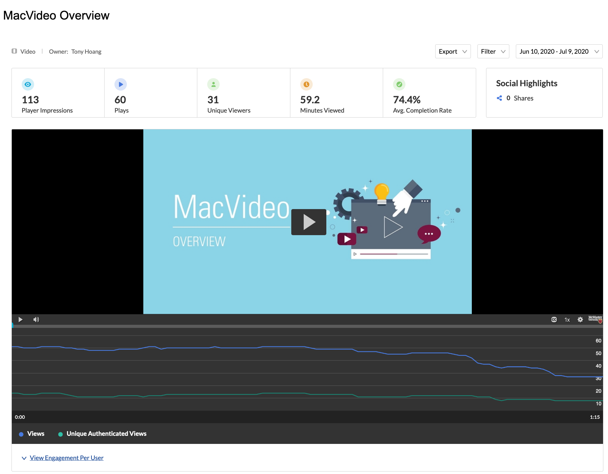
The top panel of the Entry Level dashboard provides an overview with highlights and details on the specific entry.
- Highlights – player impressions, plays, unique viewers, minutes viewed and average completion rate.
Views on Playback
In this section you can see number of views over the duration of the entry. Understand which sections of the video generated interest and when you lost your audience.
User Engagement
By clicking on “View Engagement Per User” under the player graph you can see an in-depth analysis of all users that viewed this entry.
For each user you will see:
- Player impressions
- Plays
- Average completion rate
- Total Completion Rate
User Engagement Heatmap
For each user, by clicking the arrow next to their name, you can view a heatmap indicating which part of the video they watched.
For each user, 4 tiers are available to analyze their engagement on the duration of the entry:
- Not viewed – this section wasn’t viewed by the user
- Viewed once – this section was viewed once by the user
- Viewed twice – this section was viewed twice by the user
- Viewed more than 2 times – this section was viewed more than two times by the user
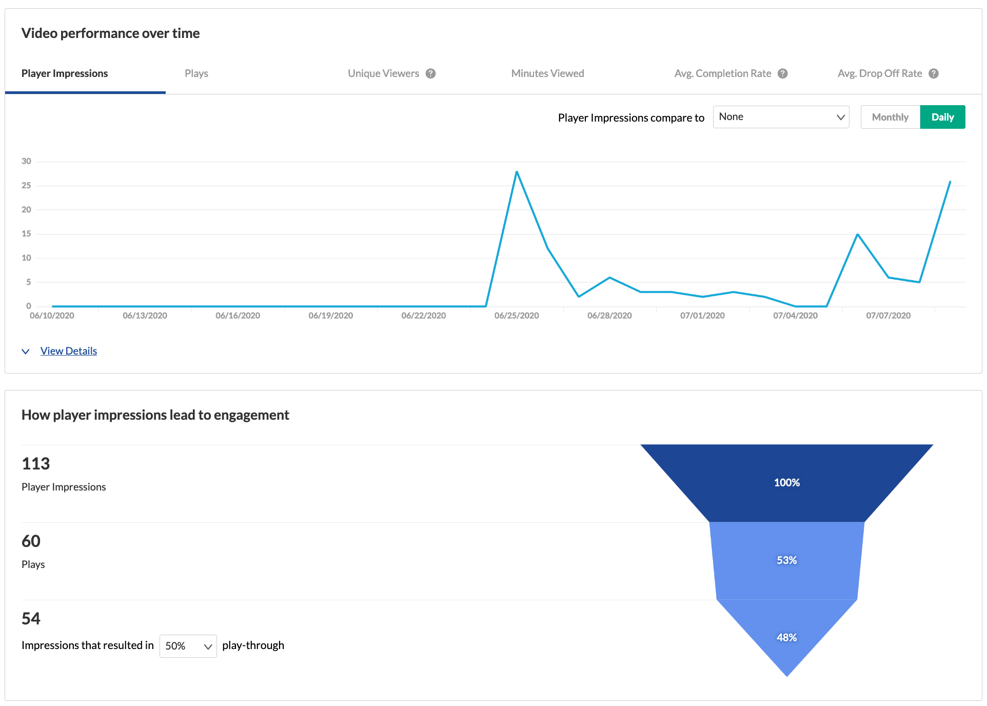
Metrics Over Time
To explore engagement trends over time, use the graph to review key metrics:
- Number of player impressions
- Number of plays
- Number of unique viewers – number of authenticated viewers, all anonymous viewers will be counted as a single viewer
- Number of minutes viewed
- Average completion rate – how much of the video was watched
- Average drop off rate – measured by viewer reaching playback quartiles
You can view the data for each metric in daily or monthly granularity. Hover over any point in the graph to see the detailed data. You can also compare to another metric by selecting another metric from the drop down list.
To change the time period or filter the data, use the date picker and filter panel at the top of the dashboard. You can also compare data from different time periods. For more information, see Working with Entry Level Analytics Dashboard.
You can click on View Details to see a table of all the metrics for the time frame.
Engagement Funnel
The engagement funnel shows the viewer journey, from discovery to viewing the entire video. The following metrics are shown in the funnel:
- Player impressions
- Plays
- Plays that reach <x%> percent play through – this can be selected by the user.
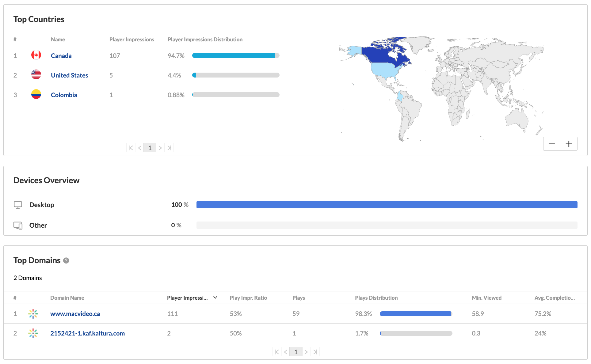
Top Countries
The Top Countries panel ranks the geographical distribution by plays. The heatmap shows the countries, the darker the shade, the more plays for that country. The table ranks the countries by plays and also shows plays distribution compared to total number of plays.
You can drill down to region by selecting a country on the map or from the table. Select a region to drill down to cities.
Devices Overview
The Devices Overview displays the distribution of devices usage by plays. You can see on which device viewers watched the entry.
Top Domains
The top domains are ordered by domains that had the most number of plays in the selected time frame. For each domain the following metrics are available:
- Plays
- Plays distribution – number of plays divided by the total number of plays in the selected timeframe
- Player impressions
- Player impression ratio – number of plays divided by number of impressions
- Minutes viewed
- Average drop off rate – measured by viewer reaching playback quartiles
You can also drill down to a specific domain to see all the URLs under that domain and the same metrics in a more granular view. You can view the data for each metric in daily or monthly granularity. Hover over any point in the graph to see the detailed data. Click on the title of the metric in the table to sort the table based on this metric.
To view more details about analytics go here.